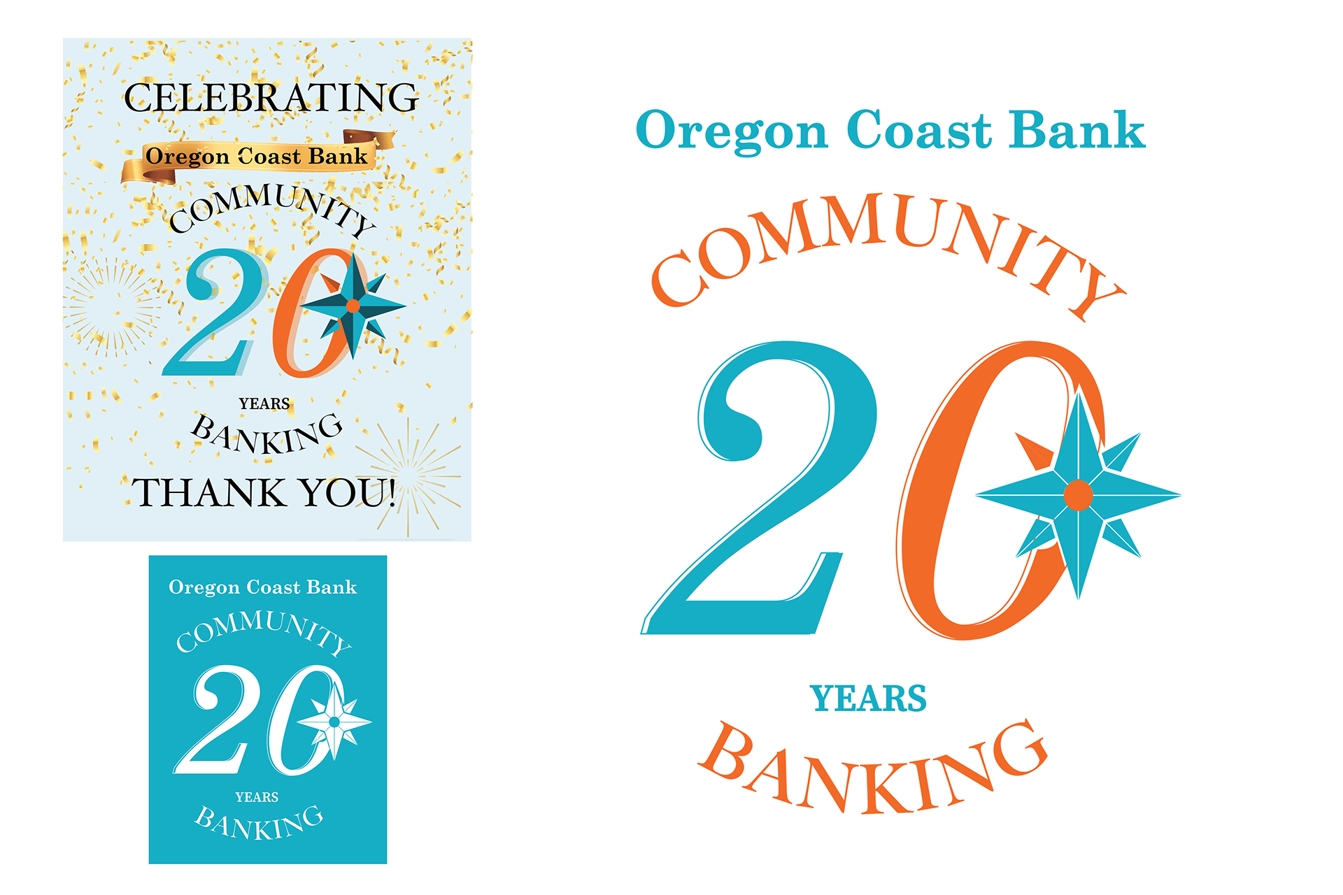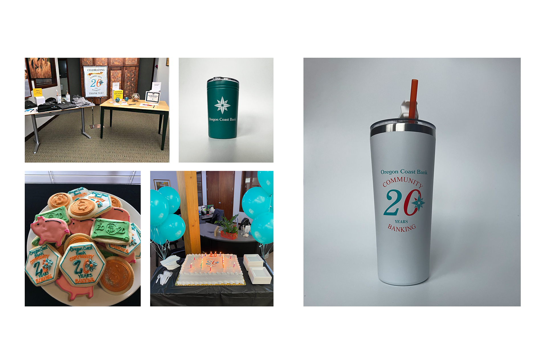
This Design for Oregon Coast Bank (OCB) was created in celebration of the community bank’s 20-year anniversary. Since establishment in 2002, a focus on giving back to the local community and establishing personable reliable relationships with its members has never wavered. This concise core value is represented through the design by not only maintaining a simplistic format, but also through the layout of the type itself. Such consistent stylization of the OCB logo allows for the design to be utilized across a variety of media and marketing products, while also being immediately recognizable. This is true for both the fully colored and monochromatic versions. The symmetrical alignment and curvature of the words ‘Community’ and ‘Banking’ creates the illusion of a circle. This reflects the importance of the role the relationship between OCB and its customers during the past 20 years has played in strengthening the connection and wealth of the community, as it shall continue to do so in the years to come.